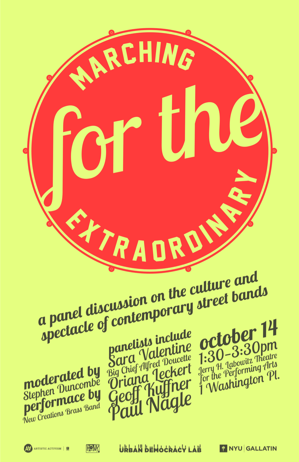
A research laboratory founded by NYU Gallatin, the Urban Democracy Lab “promotes critical, creative, just, and sustainable forms of urbanism, through scholarship, curricular activities, public engagement, and programming.” We plan events that make people think, and I tried to make our posters do the same. Most were displayed in the Broadway-facing windows at Gallatin’s One Washington Place lobby. Some included companion MailChimp templates for email campaigns.

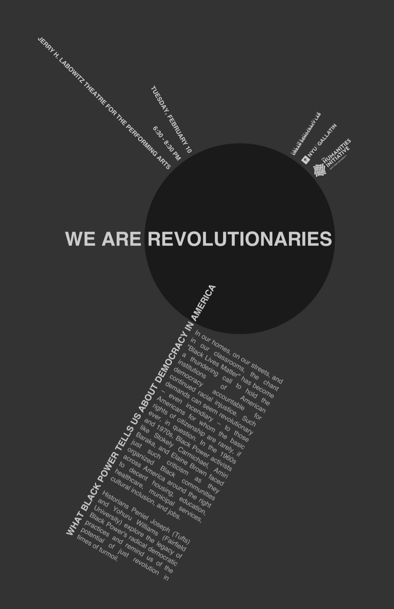
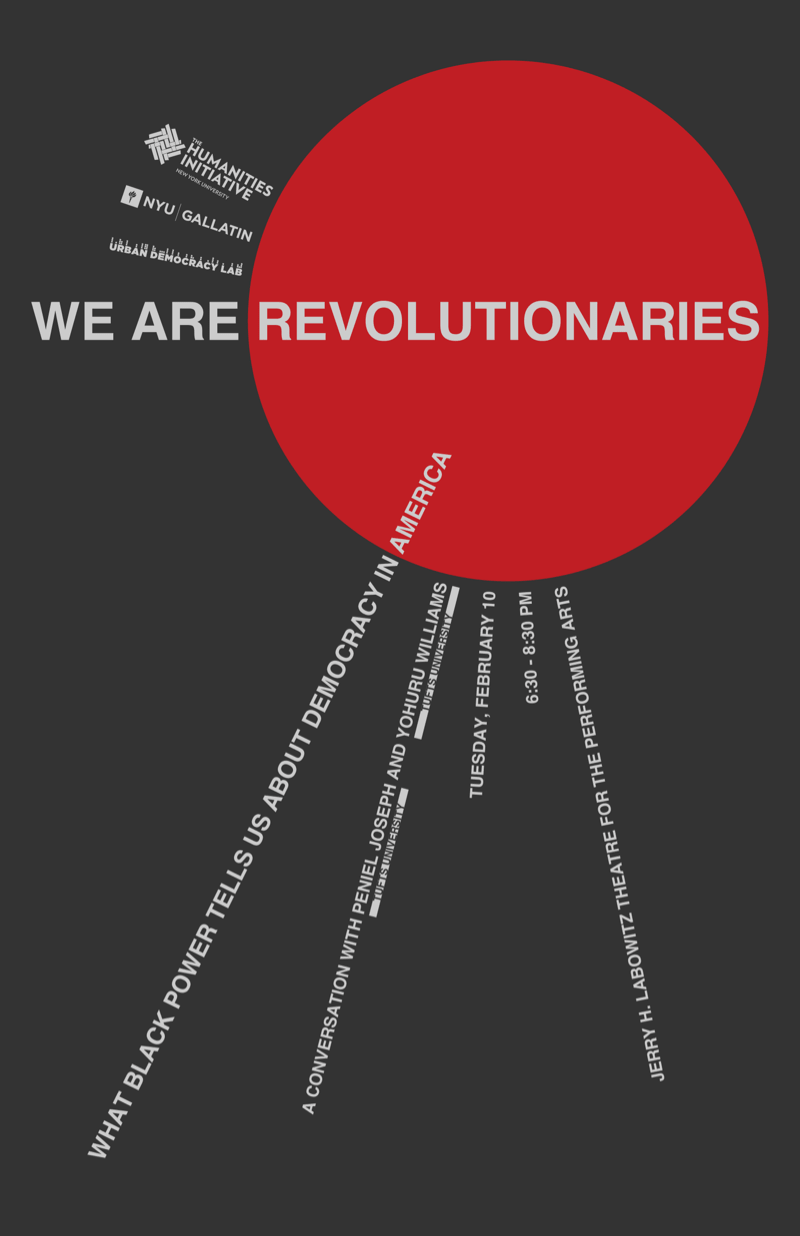
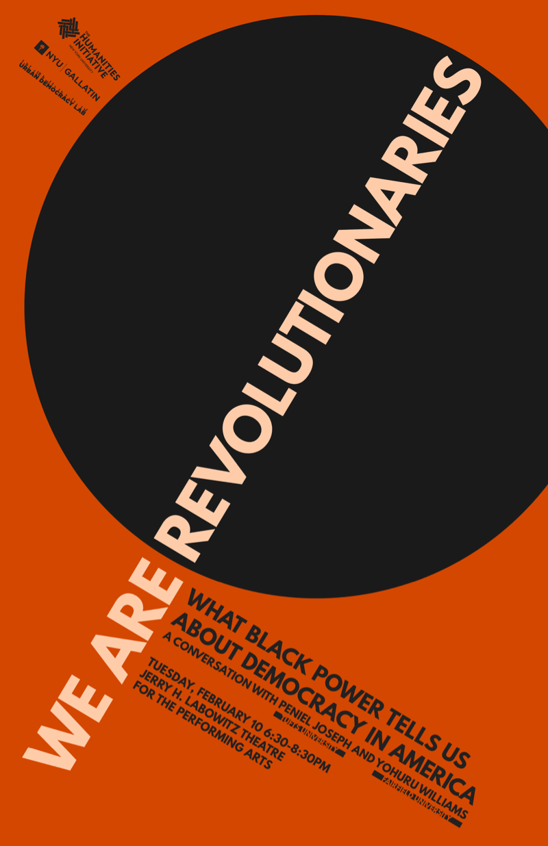
Top: final design for We Are Revolutionaries
Bottom: three rejected designs made along the way
Copyediting is a vital part of design, and often this meant slicing paragraphs of event description into a phrase or two, then trusting the poster‘s graphic tension and visual puns to communicate the rest. But our audience is more than its attention span, and try to design posters that function in three phases:
- The passerby: color scheme and iconography work to present something curious, something worth looking at. I do not spend minutes soaking in every advertisement in my periphery; I can’t expect my viewers to do the same
- The skimmer: my poster may have earned someone’s attention, but attention isn’t dedication. Short phrases set in large type and composition should make the event’s basic subject clear within five seconds, so the viewer knows if it’s worth reading on.
- The reader: now we may expect the viewer to read blocks of text, but only very special viewers make it this far. They deserve something succinct and well-composed. Details ready to be added to a calendar.
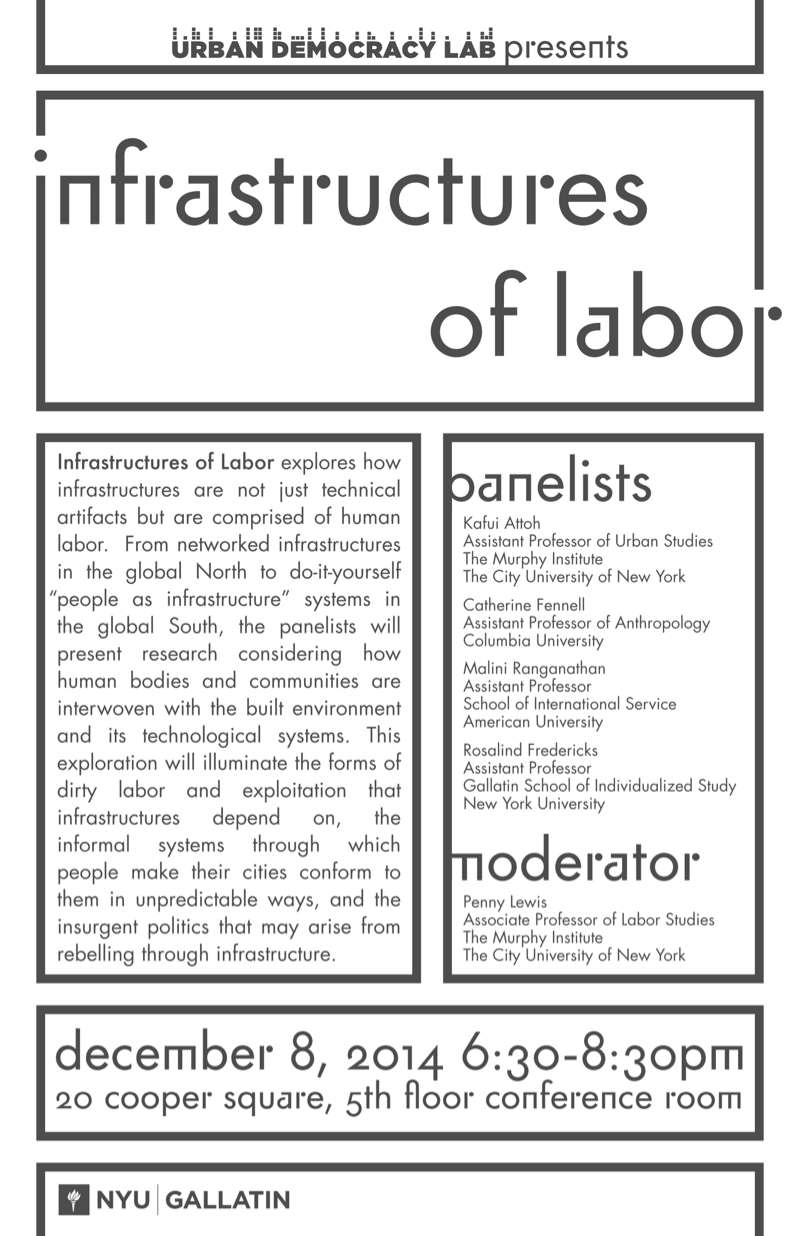
Infrastructures of Labor
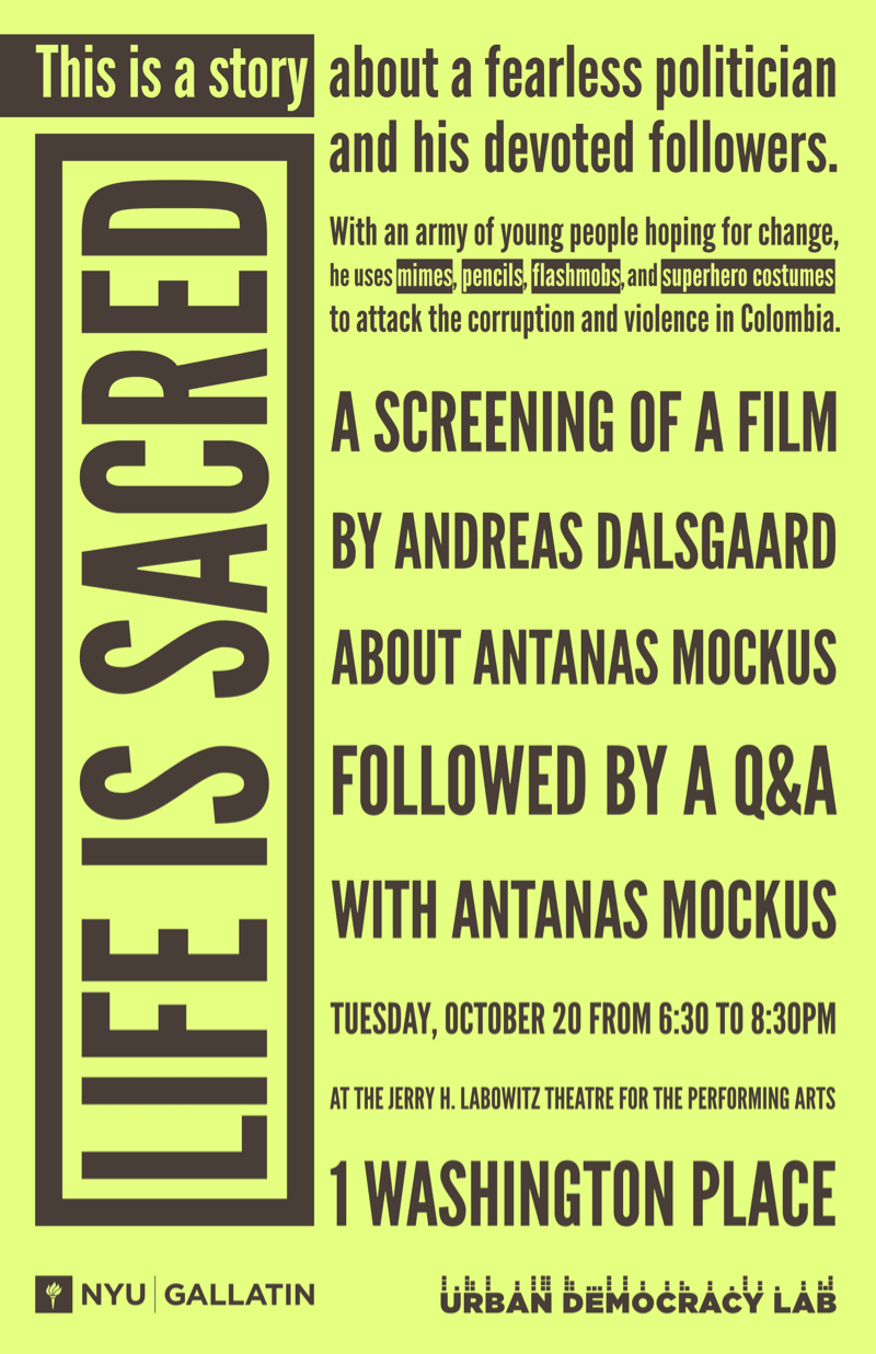
Life is Sacred
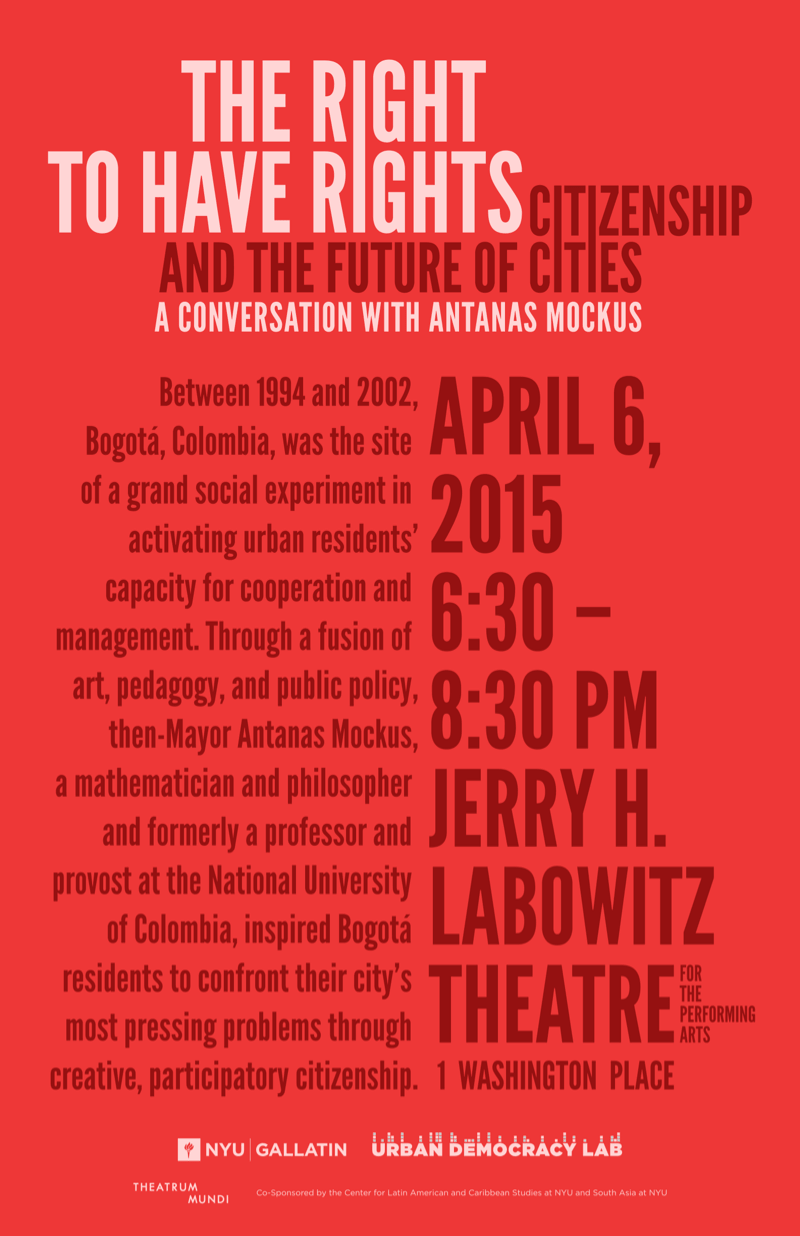
The Right to Have Rights
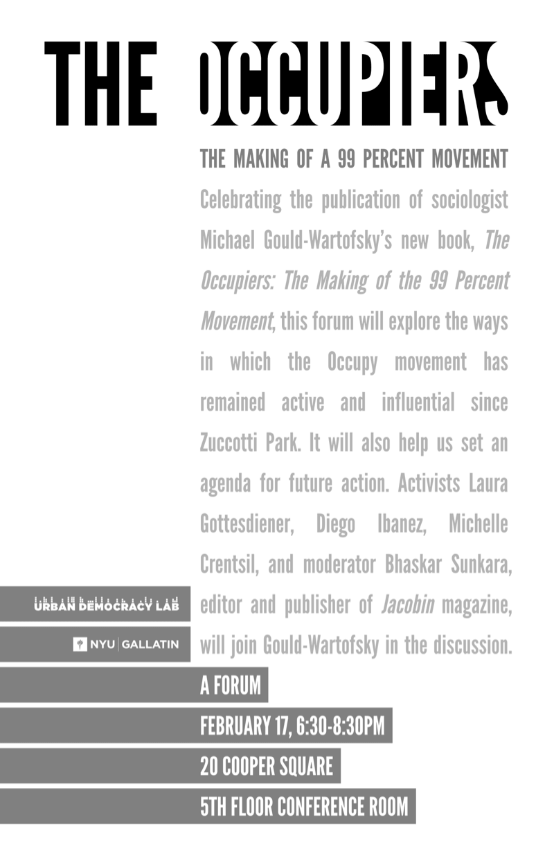
The Occupiers
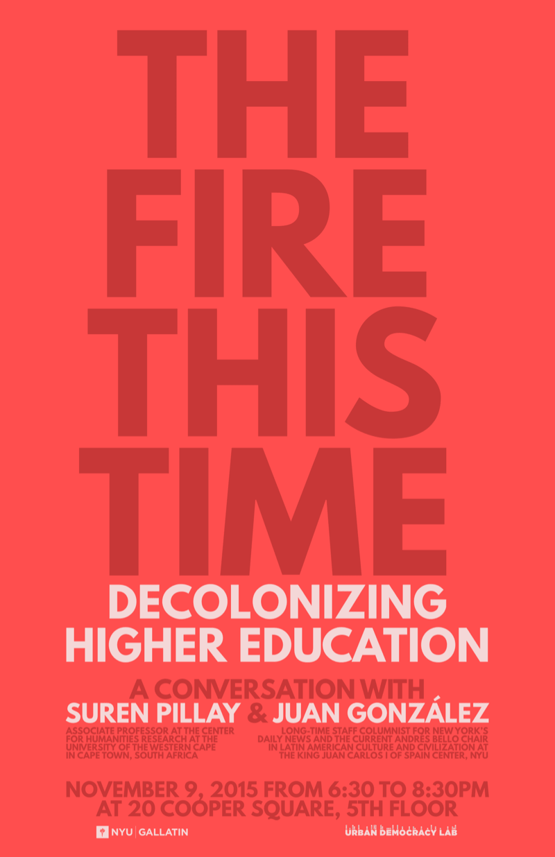
The Fire This Time
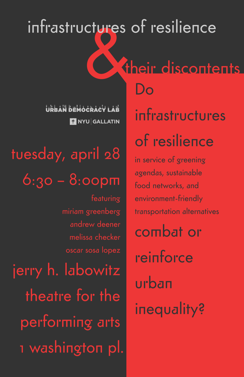
Infrustructures of Resiliance
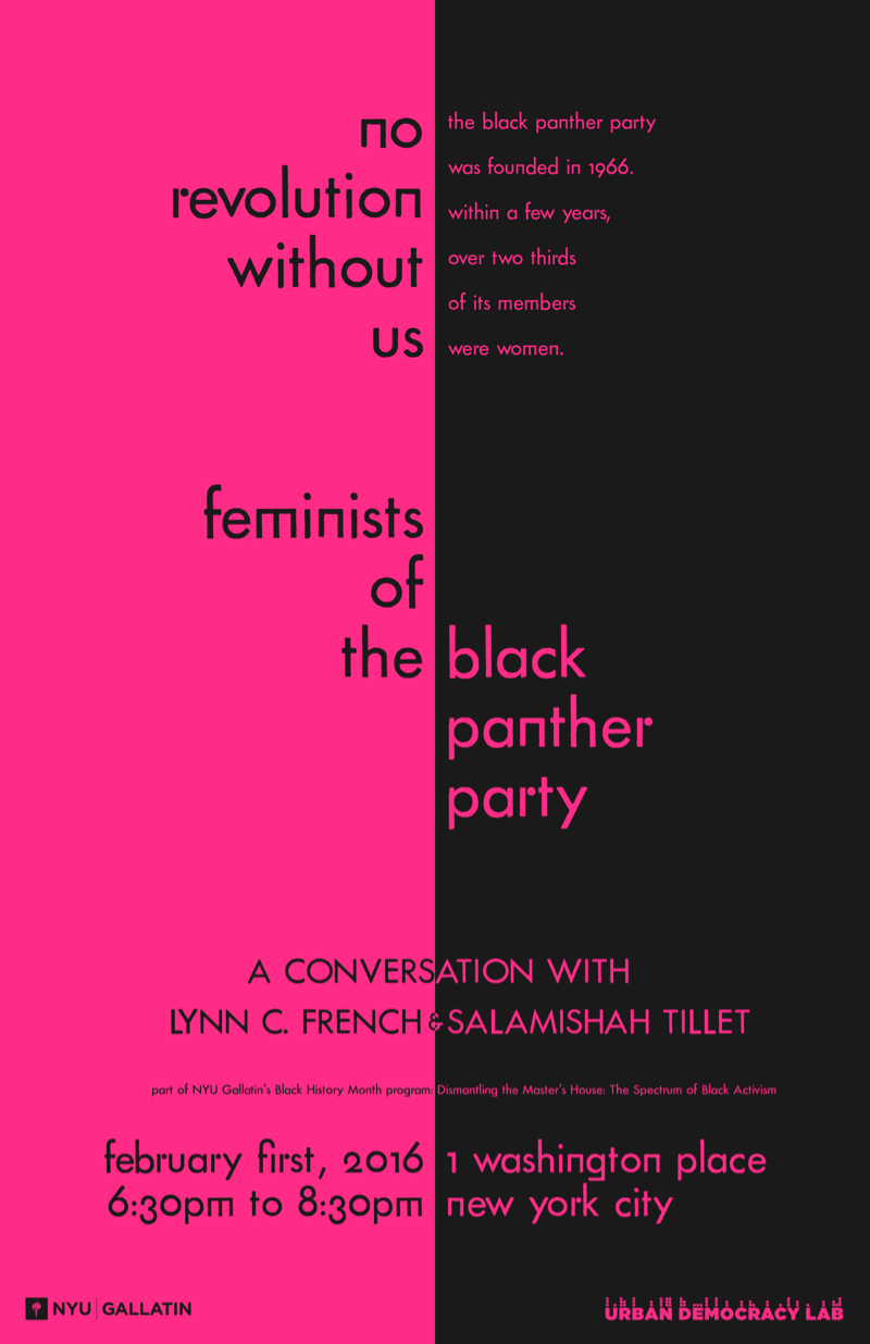
No Revolution Without Us
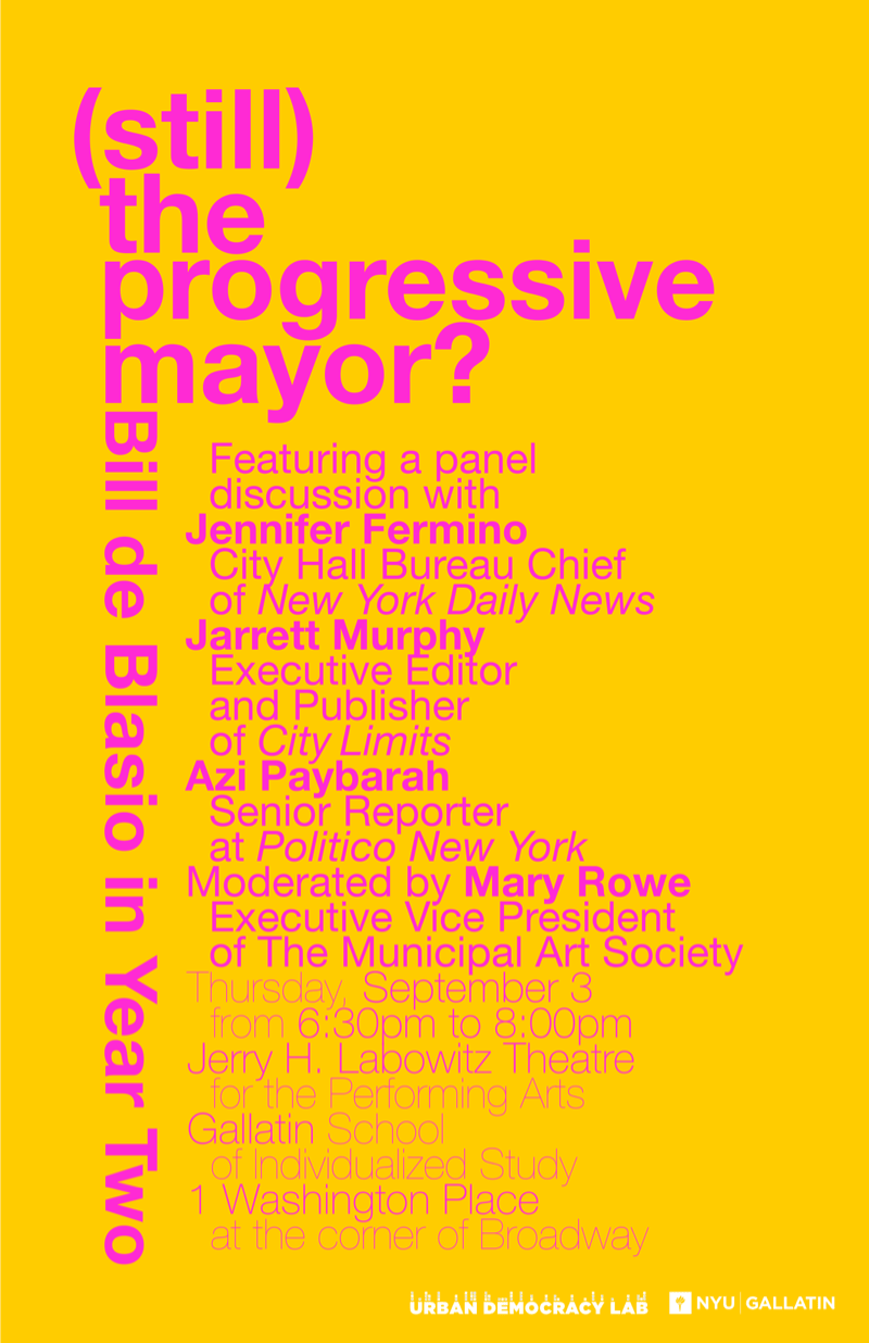
(Still) the Progressive Mayor?
Projects managed by Rebecca Amato.
Deadlines lovingly kept by Jason Laning.
Designed by Jacob Ford in 2015 and 2016.