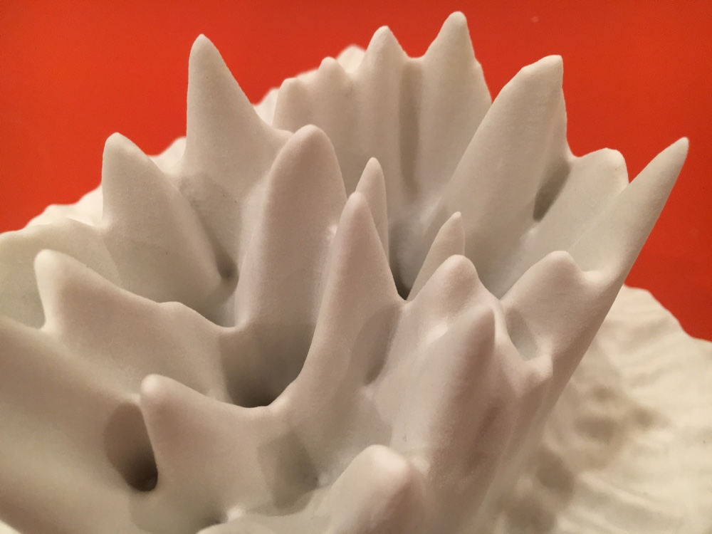
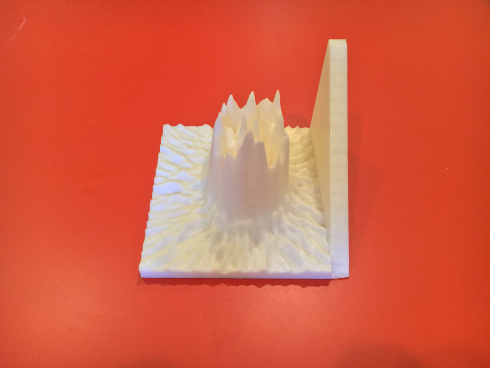
Printed on a 3D Systems ProJet 660
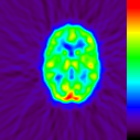
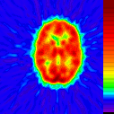
When we want want to know what’s going on inside someone’s brain, we inject a radioactive tracer into their blood and give it a minute or two to flow throughout the body. The most active areas of the brain demand the most blood, so they begin emitting the most radiation, which we can measure. The process is called a PET scan: positron emission tomography. The result is a grid of numbers: a two-dimensional slice of the brain divided into a grid x- and y-coordinates, each assigned a numeric value corresponding to its level of brain activity.
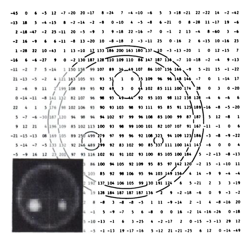
Image via Michael E. Phelps (N.b. the E.) et al.
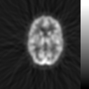
But humans struggle to derive intrinsic meaning from grids of numbers, so the numbers are mapped to color values, using a black-to-white gradient. The lowest value is mapped to black, the highest to white, and all values in between are assigned corresponding shades of grey. The grid becomes an image; coordinates now pixels. It’s our cultural instinct to represent data visually, but the habit has consequences.
On a simple black-to-white gradient, the difference between close values can be difficult to detect. Say we have a gradient mapping the values from 0 to 1 along a greyscale gradient from black to white—for this example, units aren’t important. Now say it is necessary to distinguish the color value of 0.4 from that of 0.5. We take samples of the gradient at those two points, and we get two very similar shades of grey. Those with healthy vision could probably differentiate between the two shades of grey, but most would have a difficult time placing the shades back in the gradient, and estimating their corresponding values.
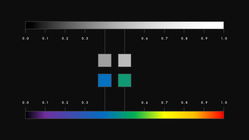
So we began to use color. When we map values along a gradient with multiple color stops, close values become much easier to distinguish. If we switch from a black-to-white gradient to one which begins at black then cycles through the rainbow of the visible spectrum, those same values of 0.4 and 0.5 are the now the difference between green and blue, instead of medium grey and lighter grey. Alternatives to the rainbow gradient were developed which used different colors in different orders, or interspersed bands within the gradient to aid in differentiation
And eventually it gets completely out of hand.
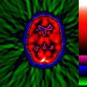
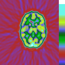
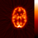
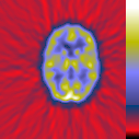
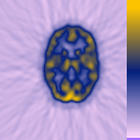
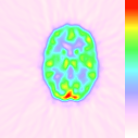
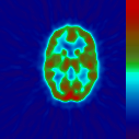
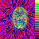
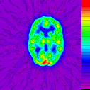
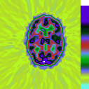
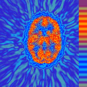
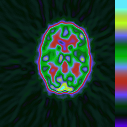
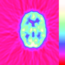
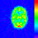
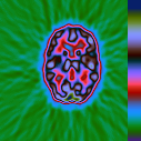
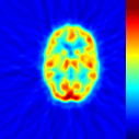
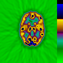
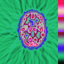
Every scan shows the exact same data from the exact same PET scan, but each mapped to a different gradient
Images via Brian Murphy
With a wealth of color options arrives a wealth of problems. Brian Murphy, collector of these images, points out one, which he calls dialing a defect: with a whole stockpile of gradients available, one can simply choose (or create) the gradient which happens to highlight whatever area of the brain they want to draw attention to, and objectivity can wither. Different medical schools have adopted different gradients as their respective “favorites,” and their students are trained on that gradient. Collaboration suffers. And we’ve formed strong cultural associations with certain colors—red means hot, or danger, or stop; blue means cold; green means good, or go—strong enough that even the most well-trained neuroscientist might have trouble viewing certain colors with pure objectivity, especially when a ployingly saturated color like red falls in the middle of a gradient, and means nothing of significance.
A neuroscientist’s understanding of brain activity is a stack of representation away from the patient’s actual brain. Activity is measured via bloodflow, which is measured via radiation, which is measured numerically by a machine. The number values are mapped to color values along a gradient, and the resulting image is printed in ink or displayed on a screen, the light of which passes through a neuroscientist’s eye and is processed in that neuroscientist’s brain. The system is kind of beautiful in its intricacy, but now we’re depending on a doctor’s color perception to analyze something which is invisible.
And what about colorblind neuroscientists? What about completely blind neuroscientists? We’ve accidentally excluded an entire community of people who cannot fully see from a field which is all about exploring something which cannot be seen.
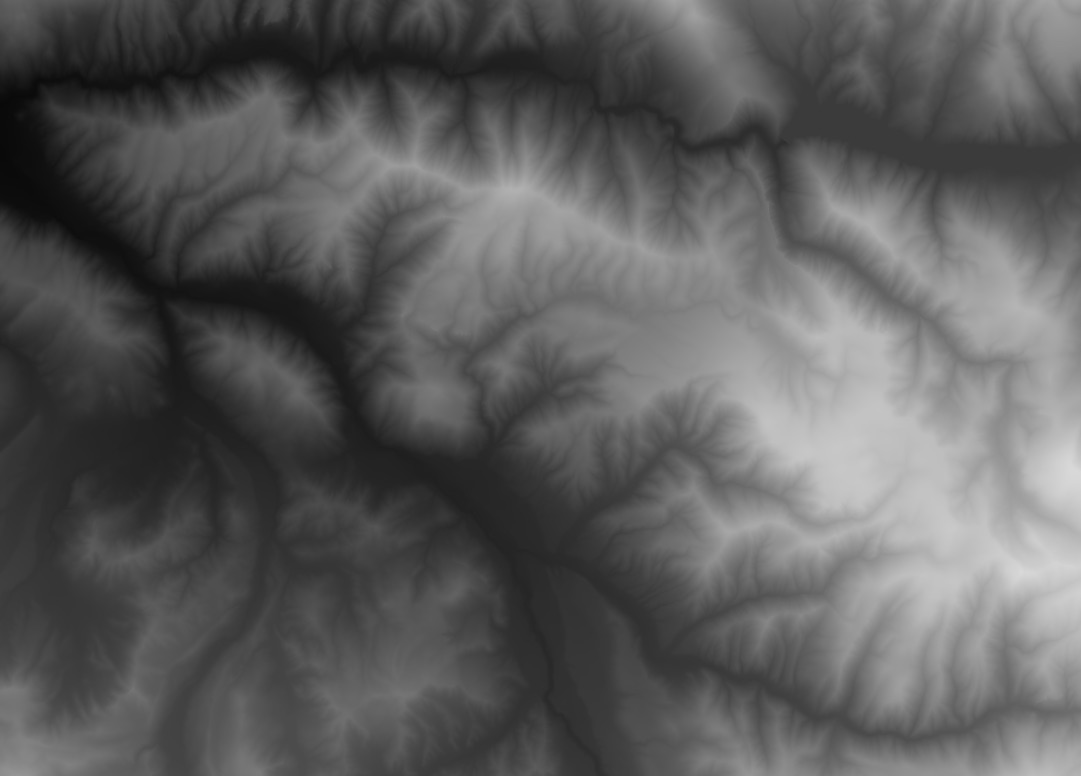
DEM image of Larkspur Mountain, Colorado, via Terrain.Party
There’s another popular use for gradients: storing geographic elevation data. Terrain data can be stored as a regular image file, where each pixel represents a geographic coordinate, and the color value of that pixel corresponds to the elevation at that point. The highest elevation is mapped to white, the lowest to black. It’s called a DEM image: a digital elevation model, stored as an image. The only difference is that we never really analyze these flat images as terrain data. The image is only an intermediary data format, and as soon as possible it is converted into a 3D model of the land it represents.
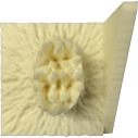
So I ran the result of a PET scan through software designed for converting DEM images into 3D elevation models, and got the terrain of a working brain. The wondrous thing about 3D models is that they can be 3D-printed, and brain activity can be made tactile.
Printed on a Stratasys Mojo
Physical space is much more universal, much less arbitrary than visual space. No training is necessary; we—the human species—have been exploring and manipulating it for a very long time. It comes very naturally that a physical peak on a 3D model might represent an area of high activity in the brain, and that a valley could represent a relatively inactive area. Background scatter radiation, the radiating lines which in some color gradients becomes oddly apparent, is easy for the human brain to isolate and filter out on a physical model. We could employ calipers and measuring sticks—devices we already use to measure physical reality—to measure and compare brain activity. The blind could feel brain activity, and understand it using a sense already keenly developed.
This project does not exist to say everything we’ve been doing to analyze the brain is incorrect, but to ask why we’ve chosen our sense of vision to be the authoritative experience of the world and its data. Why not also trust in our sense of touch?
Inspired by Joseph Dumit’s Picturing Personhood.
Developed in Matthew Stanley’s class at NYU Gallatin.
Designed by Jacob Ford in December 2015.