![Closeup: gallatin / faculty / show / 2013, where one ligature from each line shares a stroke with its neighbor. Top three lines are black, bottom is cyan. All on just offwhite.](detail_cover.jpg)
Independent characters sharing elements: the exhibition's visual identity
Professors at NYU’s Gallatin School do strange and wonderful things, much of which is worthy of display in Gallatin’s first-floor gallery space. While working as an assistant curator for the Gallatin Galleries, I was responsible for designing a visual identity and assembling a printed exhibition catalog for 2013’s iteration of the show.
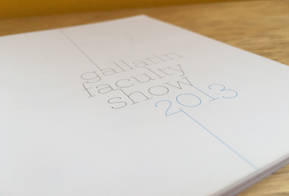
![Straigthon: booklet cover: gallatin / faculty / show / 2013, where one ligature from each line shares a stroke with its neighbor](cover.jpg)
Front cover
![Two-page spread on Matthew Gregory](spread_gregory.jpg)
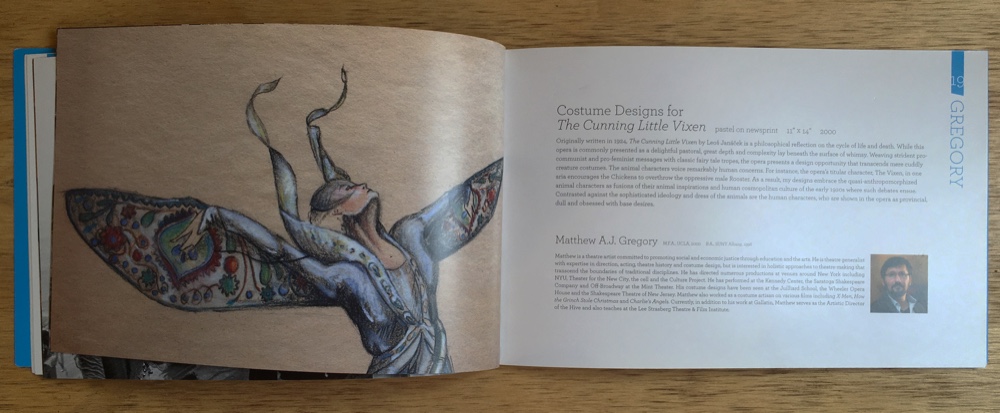
Pages 18–19: Matthew Gregory
![Two-page spread on Mitchell Joachim](spread_joachim.jpg)
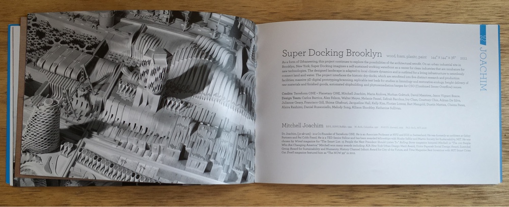
Pages 24–25: Mitchell Joachim
![Two-page spread on Nina Katchadourian](spread_katchadourian.jpg)
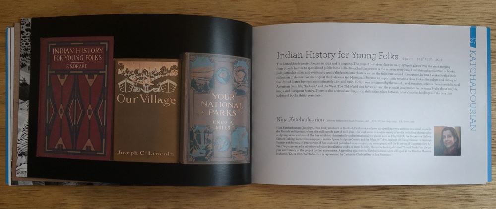
Pages 26–27: Nina Katchadourian
![Two-page spread on Meleko Mokgosi](spread_mokgosi.jpg)
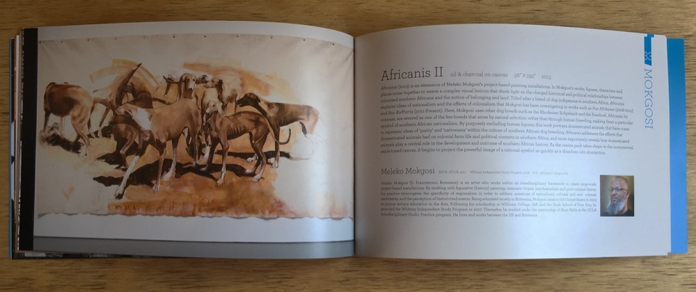
Pages 32–33: Meleko Mokgosi
![Two-page spread: left is blank, right contains a colophon](spread_colophon.jpg)
Colophon
We knew things were going to get small, so I knew things were going to have to stay crisp. Much of the catalog's color scheme is the C and the K—cyan and key (black)—of CYMK, so there would be no risk of fuzzy text from misregistration artifacts.
![Colophon: This catalog is one of five hundred / designed by Jacob Ford / and printed by DG3. // The text is set in various / weights and sizes of Archer, / designed by Hoefler & Frere-Jones / just a few blocks down the street. // Thanks to Andrew and Julia / for hugs and white balancing / and to Keith / for letting me make a colophon.](detail_colophon.jpg)
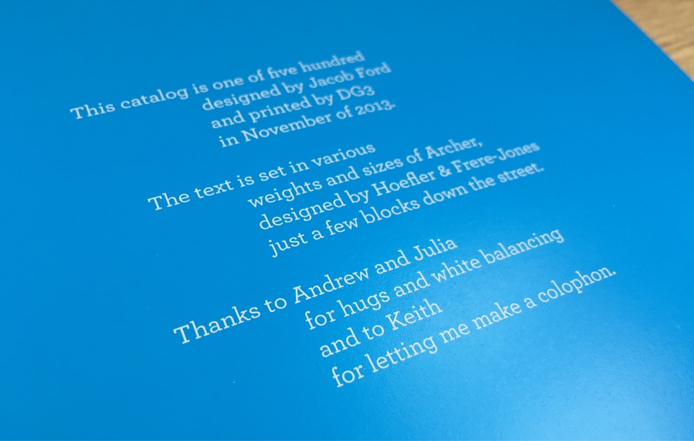
Or the Metacolophon, if you will
Project managed and show curated by Keith Miller.
Assistance and encouragement from Andrew Harvey and Julia Berke.
Designed by Jacob Ford in 2013.